// chapters.jsx — Cover + all 7 chapters + Coda + ChapterRail + Footer.

const { useState: useS, useEffect: useE, useRef: useR } = React;

// ---------- CHAPTER SHELL ----------

function ChapterShell({ id, number, heading, sub, children, tall = true }) {
  return (
    <section id={id} className="chapter" style={{
      minHeight: tall ? '100vh' : 'auto',
      padding: '128px 24px 96px',
      position: 'relative',
    }}>
      <div style={{ maxWidth: 1340, margin: '0 auto' }}>
        <Reveal>
          <span style={{
            color: 'var(--ink-3)', fontSize: 12.5, fontWeight: 500,
            letterSpacing: '0.2em', textTransform: 'uppercase',
          }}>Ch. {number}</span>
        </Reveal>
        <Reveal delay={0.05}>
          <h2 style={{
            marginTop: 10, fontSize: 'clamp(42px, 6vw, 66px)', fontWeight: 800,
            letterSpacing: '-0.03em', lineHeight: 0.98,
          }}>{heading}</h2>
        </Reveal>
        {sub && (
          <Reveal delay={0.12}>
            <p style={{
              marginTop: 14, fontFamily: 'var(--serif)', fontWeight: 700,
              color: 'var(--ink-2)', fontSize: 22, maxWidth: 640, lineHeight: 1.4,
            }}>{sub}</p>
          </Reveal>
        )}
        <div style={{ marginTop: 56 }}>{children}</div>
      </div>
    </section>
  );
}

// ---------- INTRO (HERO + ABOUT, MERGED) ----------

const INTRO_STATS = [
  { num: '5+',  label: 'Years Experience' },
  { num: '20+', label: 'Projects' },
];

const INTRO_SOCIALS = [
  {
    label: 'GitHub', href: 'https://github.com/chintan-diwakar', bg: '#1a1614', shadow: 'rgba(26,22,20,0.38)',
    icon: (
      <svg width="20" height="20" viewBox="0 0 24 24" fill="currentColor" aria-hidden="true">
        <path d="M12 .5C5.73.5.7 5.53.7 11.8c0 4.95 3.21 9.15 7.67 10.63.56.1.77-.24.77-.54 0-.27-.01-1.16-.02-2.1-3.12.68-3.78-1.32-3.78-1.32-.51-1.3-1.25-1.64-1.25-1.64-1.02-.7.08-.69.08-.69 1.13.08 1.72 1.16 1.72 1.16 1 1.72 2.63 1.22 3.27.94.1-.73.39-1.22.71-1.5-2.49-.28-5.11-1.25-5.11-5.54 0-1.22.44-2.22 1.16-3.01-.12-.28-.5-1.42.11-2.96 0 0 .94-.3 3.08 1.15a10.7 10.7 0 0 1 2.8-.38c.95 0 1.91.13 2.8.38 2.13-1.45 3.07-1.15 3.07-1.15.61 1.54.23 2.68.11 2.96.72.79 1.16 1.79 1.16 3.01 0 4.3-2.63 5.25-5.13 5.53.4.35.76 1.04.76 2.1 0 1.52-.01 2.74-.01 3.11 0 .3.2.65.78.54 4.46-1.48 7.66-5.68 7.66-10.63C23.3 5.53 18.27.5 12 .5Z"/>
      </svg>
    ),
  },
  {
    label: 'LinkedIn', href: 'https://www.linkedin.com/in/chintandiwakar/', bg: '#0A66C2', shadow: 'rgba(10,102,194,0.40)',
    icon: (
      <svg width="20" height="20" viewBox="0 0 24 24" fill="currentColor" aria-hidden="true">
        <path d="M20.45 20.45h-3.56v-5.57c0-1.33-.03-3.04-1.85-3.04-1.85 0-2.14 1.45-2.14 2.94v5.67H9.34V9h3.42v1.56h.05c.48-.9 1.64-1.85 3.37-1.85 3.6 0 4.27 2.37 4.27 5.46v6.28ZM5.34 7.43a2.07 2.07 0 1 1 0-4.14 2.07 2.07 0 0 1 0 4.14ZM7.12 20.45H3.56V9h3.56v11.45ZM22.22 0H1.78C.8 0 0 .78 0 1.74v20.52C0 23.22.8 24 1.78 24h20.44c.98 0 1.78-.78 1.78-1.74V1.74C24 .78 23.2 0 22.22 0Z"/>
      </svg>
    ),
  },
];

// Stat counters — used in the "Things I've built" section.
function StatsRow({ isMobile = false }) {
  return (
    <div style={{ display: 'flex', gap: isMobile ? 36 : 64, flexWrap: 'wrap' }}>
      {INTRO_STATS.map(s => {
        const plus = s.num.endsWith('+');
        const base = plus ? s.num.slice(0, -1) : s.num;
        return (
          <div key={s.label}>
            <div style={{
              fontSize: isMobile ? 40 : 56, fontWeight: 800, letterSpacing: '-0.03em',
              lineHeight: 1, color: 'var(--ink)', fontVariantNumeric: 'tabular-nums',
            }}>{base}{plus && <span style={{ color: 'var(--coral)' }}>+</span>}</div>
            <div style={{
              marginTop: 10, fontSize: 11.5, fontWeight: 600, letterSpacing: '0.14em',
              textTransform: 'uppercase', color: 'var(--ink-3)',
            }}>{s.label}</div>
          </div>
        );
      })}
    </div>
  );
}

function Intro() {
  const isMobile = useIsMobile();
  const scrollToWork = () => {
    const el = document.getElementById('ch-02');
    if (el) el.scrollIntoView({ behavior: 'smooth', block: 'start' });
  };

  const EYEBROW = (
    <span style={{
      display: 'inline-block',
      color: 'var(--ink-3)', fontSize: isMobile ? 10.5 : 12.5, fontWeight: 600,
      letterSpacing: isMobile ? '0.12em' : '0.18em', textTransform: 'uppercase',
    }}>Full-Stack Developer · AI Engineer · Mumbai</span>
  );

  const HEADING = (
    <h1 style={{
      marginTop: 14,
      fontSize: isMobile ? 'clamp(44px, 12vw, 56px)' : 'clamp(52px, 6.4vw, 88px)',
      fontWeight: 700, letterSpacing: '-0.035em', lineHeight: 0.98, margin: '14px 0 0',
      textAlign: isMobile ? 'center' : 'left',
    }}>
      Hi, I'm{' '}
      <span style={{ fontFamily: 'var(--serif)', fontWeight: 700, color: 'var(--coral)' }}>Chintan.</span>
    </h1>
  );

  const DESC = (
    <p style={{
      marginTop: 22,
      fontSize: isMobile ? 17 : 19, lineHeight: 1.7, letterSpacing: '-0.003em',
      color: 'var(--ink-2)', maxWidth: 540, textAlign: isMobile ? 'center' : 'left',
    }}>
      For the past 5 years I've been building{' '}
      <span style={{ color: 'var(--ink)', fontWeight: 500 }}>SaaS platforms</span>,{' '}
      <span style={{ color: 'var(--ink)', fontWeight: 500 }}>AI agents</span>, and{' '}
      <span style={{ color: 'var(--ink)', fontWeight: 500 }}>automation systems</span>{' '}
      that solve real business problems. I don't just build CRUD apps —{' '}
      <span style={{ fontFamily: 'var(--serif)', fontWeight: 700, color: 'var(--coral)' }}>I build systems that think.</span>
    </p>
  );

  const SOCIALS = (
    <div style={{ display: 'flex', gap: 12, flexWrap: 'wrap', justifyContent: isMobile ? 'center' : 'flex-start' }}>
      {INTRO_SOCIALS.map(s => (
        <a key={s.label} href={s.href} aria-label={s.label} title={s.label}
           target="_blank" rel="noreferrer"
           style={{
             display: 'inline-flex', alignItems: 'center', gap: 9,
             padding: '13px 22px', borderRadius: 12,
             background: s.bg, color: '#fff',
             fontSize: 14, fontWeight: 600, letterSpacing: '0.02em',
             boxShadow: `0 10px 24px -10px ${s.shadow}`,
             transition: 'transform .22s, box-shadow .22s, filter .22s',
           }}
           onMouseEnter={e => {
             e.currentTarget.style.transform = 'translateY(-3px)';
             e.currentTarget.style.boxShadow = `0 18px 34px -12px ${s.shadow}`;
             e.currentTarget.style.filter = 'brightness(1.08)';
           }}
           onMouseLeave={e => {
             e.currentTarget.style.transform = 'translateY(0)';
             e.currentTarget.style.boxShadow = `0 10px 24px -10px ${s.shadow}`;
             e.currentTarget.style.filter = 'none';
           }}>
          {s.icon}
          <span>{s.label}</span>
        </a>
      ))}
    </div>
  );

  const PHOTO = (
    <Polaroid
      portrait
      tilt={isMobile ? -2 : -5}
      src="photos/chintan.png"
      place="Chintan"
      year="2026"
      paint={{ from: '#f0c688', to: '#a04527', mood: 'sandstone' }}
      animateIn
      index={4}
      style={{ maxWidth: isMobile ? 168 : 360 }}
    />
  );

  const SCROLL = (
    <button onClick={scrollToWork} aria-label="Scroll to work" style={{
      display: 'inline-flex', alignItems: 'center', gap: 8,
      background: 'transparent', border: 'none', color: 'var(--ink-3)',
      fontSize: 12.5, fontWeight: 600, letterSpacing: '0.12em', textTransform: 'uppercase',
      transition: 'color .22s',
    }}
    onMouseEnter={e => { e.currentTarget.style.color = 'var(--coral)'; }}
    onMouseLeave={e => { e.currentTarget.style.color = 'var(--ink-3)'; }}>
      Selected work
      <svg width="12" height="14" viewBox="0 0 12 14" fill="none">
        <path d="M6 1 L6 12 M2 8 L6 13 L10 8" stroke="currentColor" strokeWidth="1.5" strokeLinecap="round" strokeLinejoin="round"/>
      </svg>
    </button>
  );

  const BG = `
    radial-gradient(1100px 700px at 80% 6%, rgba(201,100,66,0.13), transparent 60%),
    radial-gradient(900px 700px at 6% 96%, rgba(160,154,146,0.14), transparent 60%),
    var(--bg)
  `;

  if (isMobile) {
    return (
      <section id="cover" style={{
        minHeight: '100vh', padding: '74px 18px 88px', position: 'relative',
        display: 'flex', flexDirection: 'column', alignItems: 'center', justifyContent: 'center',
        background: BG, overflow: 'hidden',
      }}>
        <div style={{ width: '100%', maxWidth: 520, display: 'flex', flexDirection: 'column', alignItems: 'center', gap: 16 }}>
          <Reveal style={{ width: '100%', textAlign: 'center' }}>{EYEBROW}{HEADING}</Reveal>
          <Reveal delay={0.35}>{PHOTO}</Reveal>
          <Reveal delay={0.5}>{SOCIALS}</Reveal>
          <Reveal delay={0.62} style={{ width: '100%' }}>{DESC}</Reveal>
        </div>
      </section>
    );
  }

  // ----- desktop -----
  return (
    <section id="cover" style={{
      minHeight: '100vh', padding: '0 24px', position: 'relative',
      display: 'flex', alignItems: 'center',
      background: BG, overflow: 'hidden',
    }}>
      <svg className="cd-cover-guide" viewBox="0 0 200 600" preserveAspectRatio="none" style={{
        position: 'absolute', right: '12%', top: 0, height: '100%', width: 160, opacity: 0.16, pointerEvents: 'none',
      }}>
        <path d="M100 0 Q60 200, 110 360 T 90 600" stroke="var(--coral)" strokeWidth="1.2" fill="none" strokeDasharray="2 6" />
      </svg>

      <div style={{ maxWidth: 1340, margin: '0 auto', width: '100%', position: 'relative', zIndex: 2, padding: '120px 0 80px' }}>
        <div style={{ display: 'grid', gridTemplateColumns: 'minmax(0,1.5fr) minmax(0,1fr)', gap: 72, alignItems: 'center' }}>
          <div>
            <Reveal>{EYEBROW}{HEADING}</Reveal>
            <Reveal delay={0.18}>{DESC}</Reveal>
            <Reveal delay={0.32}><div style={{ marginTop: 32 }}>{SOCIALS}</div></Reveal>
            <Reveal delay={0.46}><div style={{ marginTop: 36 }}>{SCROLL}</div></Reveal>
          </div>
          <div style={{ display: 'flex', justifyContent: 'flex-end' }}>{PHOTO}</div>
        </div>
      </div>
    </section>
  );
}

// ---------- CH.02 — BUILT (CARD SWIPER WITH FLIP) ----------
// A horizontal carousel of 8 project cards. Each card flips on click to
// reveal a longer description. Nav: prev/next arrows + dot pagination.
// Front shows: visual glyph, name, when, short description, tags, links.
// Back shows: same chrome + the longer back copy.

function ShowcaseGlyph({ kind }) {
  if (kind === 'matrix') {
    return (
      <svg viewBox="0 0 200 100" preserveAspectRatio="xMidYMid slice" style={{ width: '100%', height: '100%' }}>
        <defs>
          <linearGradient id="m-bg" x1="0" y1="0" x2="1" y2="1">
            <stop offset="0%" stopColor="#f7e8c8"/>
            <stop offset="100%" stopColor="#e8c89a"/>
          </linearGradient>
        </defs>
        <rect width="200" height="100" fill="url(#m-bg)"/>
        {[...Array(6)].map((_,r) => [...Array(11)].map((_,c) => {
          const on = (r * 7 + c * 3) % 11 < 4;
          const dead = (r + c) % 8 === 0;
          return <rect key={`${r}${c}`}
            x={22 + c * 14} y={22 + r * 10} width={9} height={6}
            fill={dead ? '#c96442' : (on ? '#1a1614' : '#1a161422')}/>;
        }))}
      </svg>
    );
  }
  if (kind === 'terminal') {
    return (
      <svg viewBox="0 0 200 100" preserveAspectRatio="xMidYMid slice" style={{ width: '100%', height: '100%' }}>
        <rect width="200" height="100" fill="#d9d3c1"/>
        <rect x="20" y="18" width="160" height="64" rx="4" fill="#1a1614"/>
        <circle cx="28" cy="26" r="2" fill="#c96442"/>
        <circle cx="36" cy="26" r="2" fill="#e8c89a"/>
        <circle cx="44" cy="26" r="2" fill="#a8b89a"/>
        {[80,110,60,90,40].map((w, i) => (
          <rect key={i} x={28} y={42 + i*8} width={w} height={2} fill="#a8b89a" opacity={0.85 - i * 0.1}/>
        ))}
      </svg>
    );
  }
  if (kind === 'brew') {
    return (
      <svg viewBox="0 0 200 100" preserveAspectRatio="xMidYMid slice" style={{ width: '100%', height: '100%' }}>
        <rect width="200" height="100" fill="#efe3d2"/>
        <path d="M70 30 L130 30 L125 70 Q100 80 75 70 Z" fill="#c96442" opacity="0.9"/>
        <path d="M125 35 Q145 40 145 55 Q145 68 130 64" fill="none" stroke="#c96442" strokeWidth="2"/>
        <path d="M85 22 Q88 14 92 22 M95 18 Q98 10 102 18 M105 22 Q108 14 112 22" stroke="#1a1614" strokeWidth="1.4" fill="none" strokeLinecap="round"/>
      </svg>
    );
  }
  if (kind === 'lock') {
    return (
      <svg viewBox="0 0 200 100" preserveAspectRatio="xMidYMid slice" style={{ width: '100%', height: '100%' }}>
        <rect width="200" height="100" fill="#d9d3c1"/>
        <rect x="80" y="44" width="40" height="32" rx="3" fill="#1a1614"/>
        <path d="M88 44 Q88 28, 100 28 Q112 28, 112 44" stroke="#1a1614" strokeWidth="3" fill="none"/>
        <circle cx="100" cy="58" r="3" fill="#c96442"/>
        <rect x="100" y="58" width="2" height="8" fill="#c96442"/>
      </svg>
    );
  }
  if (kind === 'agents') {
    return (
      <svg viewBox="0 0 200 100" preserveAspectRatio="xMidYMid slice" style={{ width: '100%', height: '100%' }}>
        <rect width="200" height="100" fill="#dfe7ee"/>
        {[
          { cx: 60,  cy: 50, c: '#c96442' },
          { cx: 100, cy: 32, c: '#1a1614' },
          { cx: 140, cy: 50, c: '#5b6b4d' },
          { cx: 100, cy: 70, c: '#a04527' },
          { cx: 100, cy: 50, c: '#1a1614' },
        ].map((n, i) => (
          <g key={i}>
            <circle cx={n.cx} cy={n.cy} r="9" fill={n.c}/>
          </g>
        ))}
        <path d="M60 50 L100 50 M100 32 L100 50 M140 50 L100 50 M100 70 L100 50" stroke="#1a1614" strokeWidth="1" opacity="0.4"/>
      </svg>
    );
  }
  if (kind === 'chart') {
    return (
      <svg viewBox="0 0 200 100" preserveAspectRatio="xMidYMid slice" style={{ width: '100%', height: '100%' }}>
        <rect width="200" height="100" fill="#f0e6cf"/>
        {[15, 25, 18, 35, 28, 45, 38, 55, 48, 62, 58, 70].map((h, i) => (
          <rect key={i} x={20 + i * 14} y={88 - h} width={8} height={h}
                fill={i === 11 ? '#c96442' : '#1a1614'} opacity={i === 11 ? 1 : 0.85}/>
        ))}
      </svg>
    );
  }
  if (kind === 'md') {
    return (
      <svg viewBox="0 0 200 100" preserveAspectRatio="xMidYMid slice" style={{ width: '100%', height: '100%' }}>
        <rect width="200" height="100" fill="#e3ecd9"/>
        <rect x="36" y="20" width="128" height="64" rx="3" fill="#faf9f5" stroke="#1a1614" strokeWidth="1"/>
        <text x="46" y="40" fontFamily="JetBrains Mono, monospace" fontSize="9" fill="#c96442"># Hello</text>
        <rect x="46" y="48" width="80" height="2" fill="#1a1614" opacity="0.6"/>
        <rect x="46" y="55" width="100" height="2" fill="#1a1614" opacity="0.5"/>
        <rect x="46" y="62" width="60" height="2" fill="#1a1614" opacity="0.5"/>
        <rect x="46" y="69" width="90" height="2" fill="#1a1614" opacity="0.5"/>
      </svg>
    );
  }
  if (kind === 'cloud') {
    return (
      <svg viewBox="0 0 200 100" preserveAspectRatio="xMidYMid slice" style={{ width: '100%', height: '100%' }}>
        <rect width="200" height="100" fill="#f5e0bf"/>
        <path d="M70 60 Q60 60, 60 50 Q60 38, 75 40 Q80 26, 100 28 Q120 26, 122 42 Q140 42, 140 56 Q140 66, 128 66 L72 66 Q70 66, 70 60 Z" fill="#1a1614"/>
        <circle cx="100" cy="50" r="6" fill="#c96442"/>
      </svg>
    );
  }
  return null;
}

// Product Hunt logomark — orange disc with the "P".
function PHLogo({ size = 20 }) {
  return (
    <svg width={size} height={size} viewBox="0 0 40 40" style={{ display: 'block', flex: '0 0 auto' }}>
      <circle cx="20" cy="20" r="20" fill="#DA552F" />
      <path d="M16.5 28 V12 H22.5 a4 4 0 0 1 0 8 H16.5"
            fill="none" stroke="#ffffff" strokeWidth="2.8" strokeLinejoin="round" strokeLinecap="round" />
    </svg>
  );
}

// One project card — flips on click.
function FlipCard({ p, flipped, onFlip }) {
  return (
    <div onClick={onFlip} className="cd-flipwrap"
      style={{
        width: '100%', height: '100%',
        perspective: 1400,
      }}>
      <div className={`cd-flip ${flipped ? 'is-flipped' : ''}`} style={{
        position: 'relative', width: '100%', height: '100%',
        transformStyle: 'preserve-3d',
      }}>
        {/* FRONT */}
        <div style={{
          position: 'absolute', inset: 0,
          background: 'var(--surface)',
          border: '1px solid var(--line)',
          borderRadius: 16,
          overflow: 'hidden',
          backfaceVisibility: 'hidden',
          WebkitBackfaceVisibility: 'hidden',
          display: 'flex', flexDirection: 'column',
          boxShadow: '0 1px 2px rgba(31,27,22,0.04), 0 18px 40px -24px rgba(31,27,22,0.18)',
        }}>
          <div style={{ height: 128, position: 'relative', overflow: 'hidden', flex: '0 0 auto' }}>
            <ShowcaseGlyph kind={p.glyph} />
            {p.links.ph && (
              <a href={p.links.ph} target="_blank" rel="noreferrer" onClick={(e) => e.stopPropagation()}
                 aria-label="Launched on Product Hunt"
                 style={{
                   position: 'absolute', top: 10, right: 10,
                   display: 'flex', alignItems: 'center', gap: 7,
                   background: '#ffffff', borderRadius: 8, padding: '5px 10px 5px 7px',
                   border: '1px solid rgba(20,15,10,0.08)',
                   boxShadow: '0 4px 14px -4px rgba(31,27,22,0.30)',
                 }}>
                <PHLogo size={20} />
                <span style={{ display: 'flex', flexDirection: 'column', lineHeight: 1.05 }}>
                  <span style={{ fontSize: 7, letterSpacing: '0.13em', textTransform: 'uppercase', color: '#9a948c', fontWeight: 600 }}>Launched on</span>
                  <span style={{ fontSize: 11.5, fontWeight: 700, color: '#DA552F', letterSpacing: '-0.01em' }}>Product Hunt</span>
                </span>
              </a>
            )}
          </div>
          <div style={{ padding: '15px 18px 16px', flex: 1, display: 'flex', flexDirection: 'column' }}>
            <div style={{ display: 'flex', alignItems: 'baseline', gap: 10 }}>
              <h3 style={{ fontSize: 20, fontWeight: 700, margin: 0, letterSpacing: '-0.02em', lineHeight: 1.1 }}>{p.name}</h3>
              <span style={{ marginLeft: 'auto', fontSize: 11, color: 'var(--ink-3)', fontVariantNumeric: 'tabular-nums', whiteSpace: 'nowrap' }}>{p.when}</span>
            </div>
            <p style={{
              marginTop: 3, fontSize: 13.5, color: 'var(--ink-2)', lineHeight: 1.4,
              fontFamily: 'var(--serif)', fontWeight: 700,
            }}>{p.tagline}</p>
            <p style={{ marginTop: 9, fontSize: 13, color: 'var(--ink)', lineHeight: 1.5 }}>{p.front}</p>

            {/* footer group, pinned to the bottom of the card */}
            <div style={{ marginTop: 'auto' }}>
              <div style={{ display: 'flex', gap: 6, flexWrap: 'wrap', paddingTop: 14 }}>
                {p.tags.map(t => (
                  <span key={t} style={{
                    padding: '3px 9px', fontSize: 10.5, color: 'var(--ink-2)',
                    background: 'var(--warm)', borderRadius: 6,
                  }}>{t}</span>
                ))}
              </div>
              <div style={{
                marginTop: 13, paddingTop: 12, borderTop: '1px solid var(--line)',
                display: 'flex', alignItems: 'center', gap: 14, fontSize: 12.5, flexWrap: 'wrap',
              }}>
                {p.links.live && (
                  <a href={p.links.live} target="_blank" rel="noreferrer"
                     onClick={(e) => e.stopPropagation()}
                     style={{ color: 'var(--coral)', fontWeight: 500, display: 'inline-flex', alignItems: 'center', gap: 3 }}>
                    Live <span style={{ fontSize: 11 }}>↗</span>
                  </a>
                )}
                {p.links.ph && (
                  <a href={p.links.ph} target="_blank" rel="noreferrer"
                     onClick={(e) => e.stopPropagation()}
                     style={{ color: '#DA552F', fontWeight: 500, display: 'inline-flex', alignItems: 'center', gap: 5 }}>
                    <PHLogo size={13} /> Product Hunt <span style={{ fontSize: 11 }}>↗</span>
                  </a>
                )}
                {p.links.source && (
                  <a href={p.links.source} target="_blank" rel="noreferrer"
                     onClick={(e) => e.stopPropagation()}
                     style={{ color: 'var(--ink)', display: 'inline-flex', alignItems: 'center', gap: 3 }}>
                    Source <span style={{ fontSize: 11 }}>↗</span>
                  </a>
                )}
                {p.links.blog && (
                  <a href={p.links.blog} onClick={(e) => e.stopPropagation()}
                     style={{ color: 'var(--ink-2)', display: 'inline-flex', alignItems: 'center', gap: 3 }}>
                    Blog <span style={{ fontSize: 11 }}>↗</span>
                  </a>
                )}
                <span style={{ marginLeft: 'auto', fontSize: 11, color: 'var(--ink-3)', display: 'inline-flex', alignItems: 'center', gap: 5 }}>
                  <svg width="11" height="11" viewBox="0 0 24 24" fill="none">
                    <path d="M3 12h13M9 6l-6 6 6 6M14 4h7v16h-7" stroke="currentColor" strokeWidth="1.6" strokeLinecap="round" strokeLinejoin="round"/>
                  </svg>
                  flip
                </span>
              </div>
            </div>
          </div>
        </div>

        {/* BACK */}
        <div style={{
          position: 'absolute', inset: 0,
          background: 'var(--ink)', color: 'var(--bg)',
          border: '1px solid var(--ink)',
          borderRadius: 16,
          overflow: 'hidden',
          backfaceVisibility: 'hidden',
          WebkitBackfaceVisibility: 'hidden',
          transform: 'rotateY(180deg)',
          padding: '20px 22px',
          display: 'flex', flexDirection: 'column',
          boxShadow: '0 18px 40px -24px rgba(31,27,22,0.4)',
        }}>
          <div style={{ display: 'flex', alignItems: 'baseline', gap: 10 }}>
            <h3 style={{ fontSize: 20, fontWeight: 700, margin: 0, letterSpacing: '-0.02em', color: 'var(--bg)' }}>{p.name}</h3>
            <span style={{ marginLeft: 'auto', fontSize: 11, color: 'rgba(250,249,245,0.5)' }}>{p.when}</span>
          </div>
          <div style={{
            marginTop: 10, fontSize: 10, letterSpacing: '0.08em', textTransform: 'uppercase',
            color: 'var(--coral)',
          }}>How it works</div>
          <p style={{ marginTop: 6, fontSize: 13.5, lineHeight: 1.55, color: 'rgba(250,249,245,0.86)', flex: 1 }}>
            {p.back}
          </p>
          <div style={{ marginTop: 10, fontSize: 10, letterSpacing: '0.08em', textTransform: 'uppercase', color: 'rgba(250,249,245,0.4)' }}>
            Stack
          </div>
          <div style={{ display: 'flex', gap: 5, flexWrap: 'wrap', marginTop: 6 }}>
            {p.tags.map(t => (
              <span key={t} style={{
                padding: '3px 9px', fontSize: 10.5, color: 'rgba(250,249,245,0.82)',
                background: 'rgba(250,249,245,0.10)', borderRadius: 6,
              }}>{t}</span>
            ))}
          </div>
          <div style={{
            marginTop: 12, paddingTop: 10,
            borderTop: '1px solid rgba(250,249,245,0.15)',
            display: 'flex', alignItems: 'center', fontSize: 12, gap: 12,
          }}>
            <span style={{ color: 'var(--coral)', fontFamily: 'var(--serif)', fontWeight: 700 }}>
              {p.metric}
            </span>
            <span style={{ marginLeft: 'auto', fontSize: 10.5, color: 'rgba(250,249,245,0.5)', display: 'inline-flex', alignItems: 'center', gap: 5 }}>
              <svg width="10" height="10" viewBox="0 0 24 24" fill="none">
                <path d="M3 12h13M9 6l-6 6 6 6M14 4h7v16h-7" stroke="currentColor" strokeWidth="1.6" strokeLinecap="round" strokeLinejoin="round"/>
              </svg>
              flip back
            </span>
          </div>
        </div>
      </div>
    </div>
  );
}

function Ch02_Built() {
  const items = ALL_PROJECTS;
  const [flipped, setFlipped] = useState({});  // id -> bool
  const sectionRef = useRef(null);
  const scrollerRef = useRef(null);
  const isMobile = useIsMobile();

  // Duplicate the list so the loop wraps seamlessly: the second half is an
  // exact copy of the first, so when scrollLeft crosses one half-width we can
  // teleport back by that amount with no visible jump.
  const loop = [...items, ...items];

  // Carousel control — kept in a ref so pointer moves don't trigger re-renders.
  const drag = useRef({
    paused: false,     // hover pause (desktop)
    down: false,       // pointer is pressed (may become a drag or a click)
    dragging: false,   // movement crossed the threshold → it's a real drag
    startX: 0,
    startScroll: 0,
    moved: false,      // crossed the drag threshold → suppress the click-to-flip
    pointerId: null,
    userUntil: 0,      // auto-scroll stays off until this timestamp (post-interaction settle)
  });

  // Auto-scroll loop. Runs on both desktop and mobile; pauses on hover and
  // during/just-after any manual drag or swipe. Manual scrolling (mouse drag
  // or native touch) moves scrollLeft directly; this just nudges it onward.
  useEffect(() => {
    const el = scrollerRef.current;
    if (!el) return;
    const reduce = window.matchMedia('(prefers-reduced-motion: reduce)').matches;
    const SPEED = 45; // px per second
    let raf, prev;
    const tick = (t) => {
      const s = drag.current;
      if (prev == null) prev = t;
      const dt = Math.min(0.05, (t - prev) / 1000);
      prev = t;
      const half = el.scrollWidth / 2;
      if (half > 0) {
        if (!reduce && !s.paused && !s.down && t > s.userUntil) {
          el.scrollLeft += SPEED * dt;
        }
        // seamless wrap in both directions
        if (el.scrollLeft >= half) el.scrollLeft -= half;
        else if (el.scrollLeft <= 0) el.scrollLeft += half;
      }
      raf = requestAnimationFrame(tick);
    };
    raf = requestAnimationFrame(tick);
    return () => cancelAnimationFrame(raf);
  }, []);

  // Mouse drag-to-scroll (desktop). Touch devices use native overflow scroll.
  // We DON'T capture the pointer on press — that would make a plain click
  // dispatch to the slider instead of the card, killing the flip. Capture only
  // starts once movement crosses the threshold, i.e. once it's really a drag.
  const onPointerDown = (e) => {
    const s = drag.current;
    if (e.pointerType === 'mouse' && e.button !== 0) return; // left button only
    s.down = true;
    s.dragging = false;
    s.moved = false;
    s.startX = e.clientX;
    s.startScroll = scrollerRef.current.scrollLeft;
    s.pointerId = e.pointerId;
  };
  const onPointerMove = (e) => {
    const s = drag.current;
    if (!s.down || e.pointerType !== 'mouse') return; // touch = native scroll
    const dx = e.clientX - s.startX;
    if (!s.dragging) {
      if (Math.abs(dx) <= 5) return;        // still could be a click
      s.dragging = true;
      s.moved = true;
      const el = scrollerRef.current;
      el.style.cursor = 'grabbing';
      el.setPointerCapture && el.setPointerCapture(s.pointerId);
    }
    scrollerRef.current.scrollLeft = s.startScroll - dx;
    e.preventDefault();
  };
  const endDrag = () => {
    const s = drag.current;
    if (!s.down) return;
    const el = scrollerRef.current;
    if (s.dragging) {
      el.style.cursor = 'grab';
      if (s.pointerId != null && el.releasePointerCapture) {
        try { el.releasePointerCapture(s.pointerId); } catch (_) {}
      }
    }
    s.userUntil = performance.now() + 700; // let things settle before auto resumes
    s.down = false;
    s.dragging = false;
    s.pointerId = null;
  };
  // Swallow the click that follows a drag so it doesn't flip a card.
  const onClickCapture = (e) => {
    const s = drag.current;
    if (s.moved) {
      e.stopPropagation();
      e.preventDefault();
      s.moved = false;
    }
  };

  return (
    <section ref={sectionRef} id="ch-02" style={{
      minHeight: '100vh',
      padding: isMobile ? '24px 18px 56px' : '96px 24px 80px',
      display: 'flex', flexDirection: 'column', justifyContent: isMobile ? 'flex-start' : 'center',
    }}>
      <div style={{ maxWidth: 1340, margin: '0 auto', width: '100%' }}>
        <div style={{ marginBottom: 16 }}>
          <Reveal>
            <span style={{
              color: 'var(--ink-3)', fontSize: 12.5, fontWeight: 500,
              letterSpacing: '0.2em', textTransform: 'uppercase',
            }}>Ch. 02</span>
          </Reveal>
          <h2 style={{
            marginTop: 10, fontSize: 'clamp(42px, 6vw, 66px)', fontWeight: 800,
            letterSpacing: '-0.03em', lineHeight: 0.98,
          }}>
            <SplitTitle text="Things I've built" />
            <span style={{ color: 'var(--coral)' }}>.</span>
          </h2>
          <Reveal delay={0.3}>
            <p style={{
              marginTop: 12, fontFamily: 'var(--serif)', fontWeight: 700,
              color: 'var(--ink-2)', fontSize: isMobile ? 16 : 20, maxWidth: 600, lineHeight: 1.45,
            }}>
              Side projects, built outside of my day job — tools I needed myself, then realised others could use too.
              <span style={{ color: 'var(--ink-3)' }}>
                {isMobile ? ' — swipe through them; tap a card to flip.' : ' — it scrolls on its own; drag to explore, hover to pause, click to flip.'}
              </span>
            </p>
          </Reveal>
          <Reveal delay={0.4}>
            <div style={{ marginTop: isMobile ? 28 : 36 }}>
              <StatsRow isMobile={isMobile} />
            </div>
          </Reveal>
        </div>

        {/* CARD CAROUSEL — auto-scrolls, drag (mouse) or swipe (touch) to move, hover pauses */}
        <div className="cd-slider" style={{ marginTop: 40 }}
          ref={scrollerRef}
          onMouseEnter={() => { drag.current.paused = true; }}
          onMouseLeave={() => { drag.current.paused = false; endDrag(); }}
          onPointerDown={onPointerDown}
          onPointerMove={onPointerMove}
          onPointerUp={endDrag}
          onPointerCancel={endDrag}
          onClickCapture={onClickCapture}>
          <div className="cd-cardtrack">
            {loop.map((p, i) => (
              <div key={`${p.id}-${i}`} className="cd-slide">
                <FlipCard p={p}
                  flipped={!!flipped[p.id]}
                  onFlip={() => setFlipped(f => ({ ...f, [p.id]: !f[p.id] }))} />
              </div>
            ))}
          </div>
        </div>

        {/* Hint */}
        <div style={{ marginTop: 24, display: 'flex', justifyContent: 'center', gap: 18, fontSize: 11.5, color: 'var(--ink-3)' }}>
          <span style={{ display: 'inline-flex', alignItems: 'center', gap: 6 }}>
            <span style={{ width: 6, height: 6, borderRadius: 999, background: 'var(--coral)' }}></span>
            auto-scrolling
          </span>
          <span>{isMobile ? 'swipe to explore' : 'drag to explore'}</span>
          <span>{isMobile ? 'tap a card to flip' : 'hover to pause · click to flip'}</span>
        </div>
      </div>
    </section>
  );
}

// ---------- CH.03 — WHERE I WORK ----------

function Ch04_Where() {
  const isMobile = useIsMobile();
  return (
    <ChapterShell id="ch-04" number="03"
      heading={<span>Work experience<span style={{ color: 'var(--coral)' }}>.</span></span>}
      sub="Five years of taking ambiguous briefs and turning them into shipped product — across e-commerce, fintech, and prop-tech.">
      <div style={{ position: 'relative', paddingLeft: 32 }}>
        {/* timeline spine */}
        <div style={{
          position: 'absolute', left: 6, top: 8, bottom: 8, width: 2,
          background: 'linear-gradient(to bottom, var(--coral), var(--line-2) 28%, var(--line-2))',
          borderRadius: 2,
        }}></div>

        {ROLES.map((r, i) => (
          <Reveal key={r.company} delay={i * 0.08}>
            <div style={{ position: 'relative', paddingBottom: i === ROLES.length - 1 ? 0 : 56 }}>
              {/* node */}
              <div style={{
                position: 'absolute', left: -32, top: 5, width: 14, height: 14, borderRadius: '50%',
                background: r.current ? 'var(--coral)' : 'var(--surface)',
                border: `2px solid ${r.current ? 'var(--coral)' : 'var(--line-2)'}`,
                boxShadow: r.current ? '0 0 0 5px rgba(201,100,66,0.14)' : 'none',
              }}></div>

              {/* header */}
              <div style={{ display: 'flex', alignItems: 'baseline', gap: 12, flexWrap: 'wrap' }}>
                <h3 style={{ fontSize: 25, fontWeight: 700, letterSpacing: '-0.025em', margin: 0, lineHeight: 1.1 }}>{r.company}</h3>
                {r.current && (
                  <span style={{
                    fontSize: 10.5, letterSpacing: '0.06em', textTransform: 'uppercase', fontWeight: 600,
                    color: 'var(--coral)', background: 'rgba(201,100,66,0.10)',
                    padding: '3px 9px', borderRadius: 999,
                  }}>Current</span>
                )}
                <span style={{ marginLeft: 'auto', fontSize: 13.5, color: 'var(--ink-3)', fontVariantNumeric: 'tabular-nums', whiteSpace: 'nowrap' }}>{r.range}</span>
              </div>
              <div style={{
                fontFamily: 'var(--serif)', fontWeight: 700,
                color: 'var(--ink-2)', fontSize: 18, marginTop: 3,
              }}>{r.title}</div>
              <p style={{ marginTop: 12, fontSize: 15.5, lineHeight: 1.6, color: 'var(--ink-2)', maxWidth: 640 }}>{r.summary}</p>

              {/* project highlights — grid on desktop, swipe carousel on mobile */}
              <div className="cd-hl-row" style={isMobile ? {
                marginTop: 20, display: 'flex', gap: 12,
                overflowX: 'auto', scrollSnapType: 'x mandatory',
                paddingBottom: 6, WebkitOverflowScrolling: 'touch', scrollbarWidth: 'none',
              } : {
                marginTop: 20, display: 'grid',
                gridTemplateColumns: 'repeat(auto-fill, minmax(290px, 1fr))', gap: 12,
              }}>
                {r.highlights.map((h, j) => (
                  <div key={j} style={{
                    background: 'var(--surface)', border: '1px solid var(--line)', borderRadius: 12,
                    padding: '15px 17px', display: 'flex', flexDirection: 'column', gap: 8,
                    transition: 'border-color .22s, transform .22s, box-shadow .22s',
                    ...(isMobile ? { flex: '0 0 80%', scrollSnapAlign: 'start' } : {}),
                  }}
                  onMouseEnter={e => {
                    e.currentTarget.style.borderColor = 'rgba(201,100,66,0.45)';
                    e.currentTarget.style.transform = 'translateY(-3px)';
                    e.currentTarget.style.boxShadow = '0 14px 30px -22px rgba(31,27,22,0.45)';
                  }}
                  onMouseLeave={e => {
                    e.currentTarget.style.borderColor = 'var(--line)';
                    e.currentTarget.style.transform = 'translateY(0)';
                    e.currentTarget.style.boxShadow = 'none';
                  }}>
                    <div style={{ display: 'flex', alignItems: 'center', gap: 8 }}>
                      <span style={{ width: 6, height: 6, borderRadius: 2, background: 'var(--coral)', transform: 'rotate(45deg)', flex: '0 0 auto' }}></span>
                      <span style={{
                        fontSize: 10.5, letterSpacing: '0.07em', textTransform: 'uppercase',
                        color: 'var(--coral)', fontWeight: 600,
                      }}>{h.tag}</span>
                    </div>
                    <p style={{ margin: 0, fontSize: 14, lineHeight: 1.55, color: 'var(--ink)' }}>{h.text}</p>
                  </div>
                ))}
              </div>
            </div>
          </Reveal>
        ))}
      </div>
    </ChapterShell>
  );
}

// ---------- CH.04 — POSTCARDS ----------

function Ch06_Postcards() {
  const isMobile = useIsMobile();
  // Deterministic positions for the scrapbook scatter
  const slots = [
    { top: 20,  left: 4,  tilt: -6 },
    { top: 70,  left: 32, tilt: 4 },
    { top: 0,   left: 56, tilt: -3 },
    { top: 100, left: 64, tilt: 5 },
  ];
  return (
    <section id="ch-06" style={{
      minHeight: '100vh',
      padding: isMobile ? '72px 18px 72px' : '128px 24px 96px',
      position: 'relative', overflow: 'hidden',
    }}>
      <div style={{ maxWidth: 1340, margin: '0 auto', position: 'relative' }}>
        <Reveal>
          <span style={{
            color: 'var(--ink-3)', fontSize: 12.5, fontWeight: 500,
            letterSpacing: '0.2em', textTransform: 'uppercase',
          }}>Ch. 05</span>
        </Reveal>
        <Reveal delay={0.05}>
          <h2 style={{
            marginTop: 10, fontSize: isMobile ? 'clamp(40px, 12vw, 56px)' : 'clamp(42px, 6vw, 66px)',
            fontWeight: 800, letterSpacing: '-0.03em', lineHeight: 0.98,
          }}>Travel<span style={{ color: 'var(--coral)' }}>.</span></h2>
        </Reveal>
        <Reveal delay={0.12}>
          <p style={{
            marginTop: 14, fontFamily: 'var(--serif)', fontWeight: 700,
            color: 'var(--ink-2)', fontSize: isMobile ? 18 : 22, maxWidth: 640, lineHeight: 1.4,
          }}>Places that taught me things — pinned to the page.</p>
        </Reveal>

        {/* paper-plane doodle — desktop only, it overlaps the heading on mobile */}
        {!isMobile && (
          <svg viewBox="0 0 60 60" style={{ position: 'absolute', top: 80, right: 32, width: 76, opacity: 0.5, transform: 'rotate(15deg)' }}>
            <path d="M5 30 L55 8 L40 55 L32 36 L5 30 Z" fill="none" stroke="var(--ink-3)" strokeWidth="1.2" strokeLinejoin="round"/>
            <path d="M32 36 L55 8" fill="none" stroke="var(--ink-3)" strokeWidth="1.2"/>
            <path d="M62 18 Q 78 24, 70 38 Q 84 42, 78 56" fill="none" stroke="var(--ink-3)" strokeWidth="1" strokeLinecap="round" strokeDasharray="3 4" opacity="0.7"/>
          </svg>
        )}

        <div style={{
          marginTop: isMobile ? 48 : 80, position: 'relative',
          display: 'grid',
          gridTemplateColumns: isMobile ? '1fr' : 'repeat(2, minmax(0,1fr))',
          gap: isMobile ? 56 : 60,
        }}>
          {POSTCARDS.map((p, i) => (
            <div key={p.place} style={{
              transform: isMobile
                ? 'none'
                : (i % 2 === 0 ? `translateY(${i === 0 ? 0 : 36}px)` : `translateY(${i === 1 ? 60 : 12}px)`),
            }}>
              <Polaroid
                tilt={isMobile ? slots[i].tilt / 2 : slots[i].tilt}
                index={i}
                portrait={p.portrait}
                objectFit={p.objectFit}
                objectPosition={p.objectPosition}
                src={p.src}
                video={p.video}
                place={p.place}
                year={p.year}
                paint={p.paint}
                style={{ maxWidth: isMobile ? 280 : 340, margin: '0 auto' }}
              />
              <p style={{
                marginTop: 24, fontSize: 14.5, lineHeight: 1.6, color: 'var(--ink-2)',
                maxWidth: 300, marginLeft: 'auto', marginRight: 'auto', textAlign: 'center',
                fontFamily: 'var(--serif)', fontWeight: 700,
              }}>
                {p.note}
              </p>
            </div>
          ))}
        </div>
      </div>
    </section>
  );
}

// ---------- CH.05 — WORDS ----------

// Bespoke flat-vector article thumbnails — site palette: cream/beige base,
// ink line work, one coral accent each. viewBox 240x120, cover-cropped.
function PostThumb({ kind }) {
  const svg = { width: '100%', height: '100%', display: 'block' };

  if (kind === 'matrix') {
    // react-xray — a page→component dependency graph with one coral "dead" node.
    return (
      <svg viewBox="0 0 240 120" preserveAspectRatio="xMidYMid slice" style={svg}>
        <rect width="240" height="120" fill="#f3f0e8" />
        <g stroke="#a09a92" strokeWidth="1.4" fill="none" strokeLinecap="round">
          <path d="M70 50 L58 84" />
          <path d="M72 50 L104 84" />
          <path d="M168 50 L150 84" />
          <path d="M170 50 L192 84" />
        </g>
        {/* page cards */}
        <g>
          <rect x="44" y="28" width="52" height="22" rx="4" fill="#ffffff" stroke="#1a1614" strokeWidth="1.6" />
          <rect x="50" y="34" width="28" height="3" rx="1.5" fill="#a09a92" />
          <rect x="50" y="41" width="18" height="3" rx="1.5" fill="#d8d2c6" />
          <rect x="144" y="28" width="52" height="22" rx="4" fill="#ffffff" stroke="#1a1614" strokeWidth="1.6" />
          <rect x="150" y="34" width="28" height="3" rx="1.5" fill="#a09a92" />
          <rect x="150" y="41" width="18" height="3" rx="1.5" fill="#d8d2c6" />
        </g>
        {/* component nodes */}
        <circle cx="58" cy="88" r="7" fill="#ffffff" stroke="#1a1614" strokeWidth="1.6" />
        <circle cx="150" cy="88" r="7" fill="#ffffff" stroke="#1a1614" strokeWidth="1.6" />
        <circle cx="192" cy="88" r="7" fill="#1a1614" />
        {/* coral highlighted node */}
        <circle cx="104" cy="88" r="12" fill="none" stroke="#c96442" strokeWidth="1.4" opacity="0.45" />
        <circle cx="104" cy="88" r="7.5" fill="#c96442" />
      </svg>
    );
  }

  if (kind === 'terminal') {
    // remote-terminal — generated illustration.
    return (
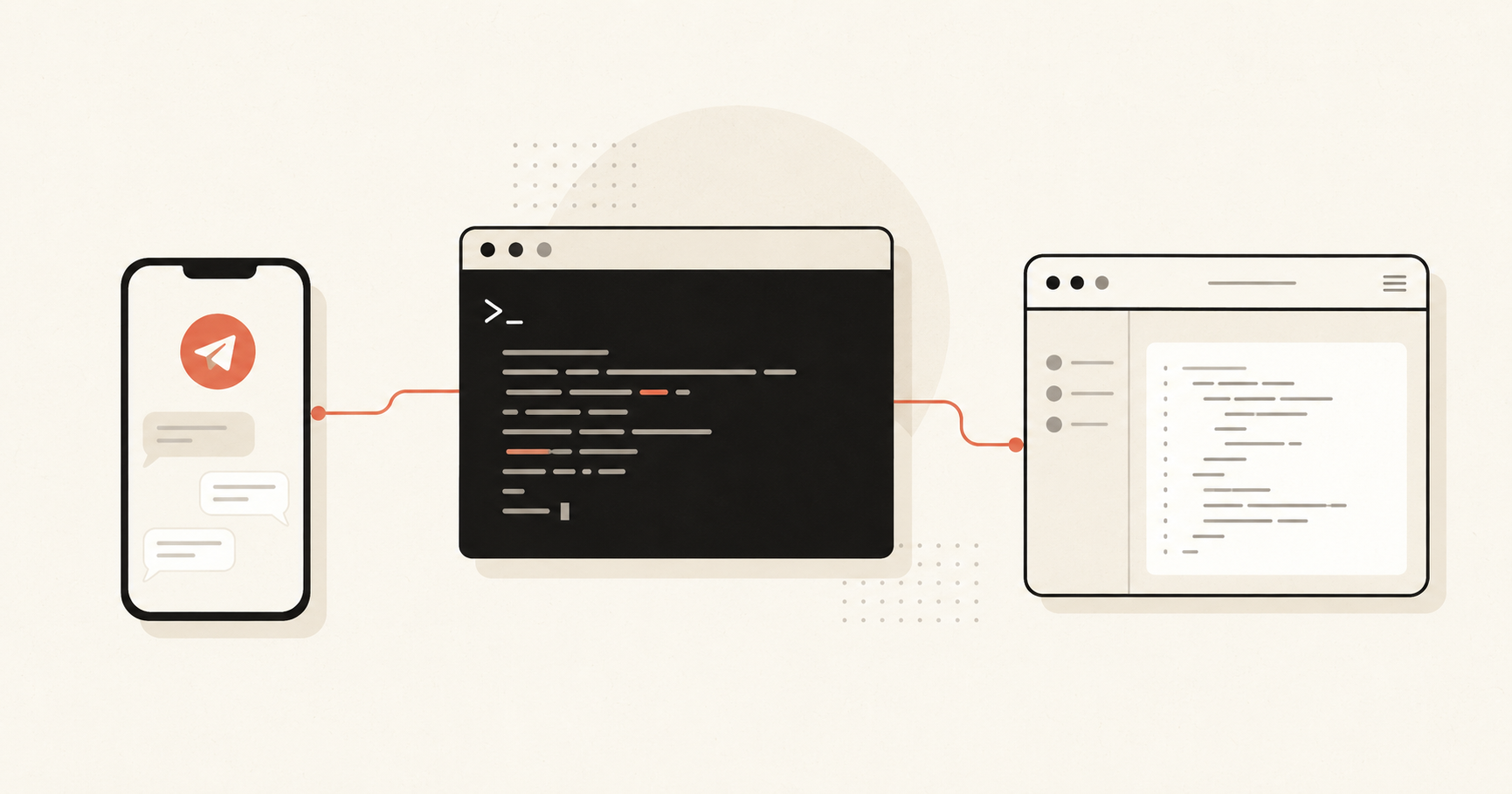
      <img src="photos/articles/remote-terminal.png" alt="Terminal linked to a phone and a browser"
           loading="lazy" style={{ width: '100%', height: '100%', objectFit: 'cover', display: 'block' }} />
    );
  }

  // brew — CopyBrewery: a mug brewing, with text fragments rising as "copy".
  return (
    <svg viewBox="0 0 240 120" preserveAspectRatio="xMidYMid slice" style={svg}>
      <rect width="240" height="120" fill="#f3f0e8" />
      {/* steam */}
      <g stroke="#a09a92" strokeWidth="1.6" fill="none" strokeLinecap="round" opacity="0.7">
        <path d="M86 42 q6 -7 0 -14" />
        <path d="M98 42 q6 -7 0 -14" />
      </g>
      {/* mug */}
      <rect x="66" y="48" width="44" height="44" rx="8" fill="#ffffff" stroke="#1a1614" strokeWidth="1.8" />
      <rect x="70" y="52" width="36" height="12" rx="4" fill="#c96442" />
      <path d="M110 58 q16 2 16 14 q0 12 -16 14" fill="none" stroke="#1a1614" strokeWidth="1.8" />
      {/* brewed copy, rising to the right */}
      <g fill="#cfc8ba">
        <rect x="140" y="50" width="44" height="4" rx="2" />
        <rect x="140" y="61" width="30" height="4" rx="2" />
        <rect x="140" y="72" width="38" height="4" rx="2" />
      </g>
      <rect x="140" y="61" width="16" height="4" rx="2" fill="#c96442" />
    </svg>
  );
}

function Ch07_Words() {
  const isMobile = useIsMobile();
  return (
    <ChapterShell id="ch-07" number="04"
      heading={<span>Articles<span style={{ color: 'var(--coral)' }}>.</span></span>}
      sub="Build logs and the occasional reflection.">
      <div style={{
        display: 'grid',
        gridTemplateColumns: isMobile ? '1fr' : 'repeat(3, 1fr)',
        gap: isMobile ? 16 : 22,
      }}>
        {POSTS.map((p, i) => (
          <Reveal key={p.title} delay={i * 0.08}>
            <a href={p.url} target="_blank" rel="noreferrer" style={{
              display: 'flex', flexDirection: 'column', height: '100%',
              background: 'var(--surface)', border: '1px solid var(--line)', borderRadius: 16,
              overflow: 'hidden',
              boxShadow: '0 1px 2px rgba(31,27,22,0.04), 0 20px 44px -30px rgba(31,27,22,0.22)',
              transition: 'transform .24s, box-shadow .24s, border-color .24s',
            }}
            onMouseEnter={e => {
              e.currentTarget.style.transform = 'translateY(-4px)';
              e.currentTarget.style.borderColor = 'rgba(201,100,66,0.45)';
              e.currentTarget.style.boxShadow = '0 16px 36px -20px rgba(31,27,22,0.4)';
            }}
            onMouseLeave={e => {
              e.currentTarget.style.transform = 'translateY(0)';
              e.currentTarget.style.borderColor = 'var(--line)';
              e.currentTarget.style.boxShadow = '0 1px 2px rgba(31,27,22,0.04), 0 20px 44px -30px rgba(31,27,22,0.22)';
            }}>
              <div style={{ height: isMobile ? 150 : 156, position: 'relative', overflow: 'hidden', borderBottom: '1px solid var(--line)' }}>
                <PostThumb kind={p.thumb} />
              </div>
              <div style={{ padding: '18px 18px 20px', display: 'flex', flexDirection: 'column', flex: 1 }}>
                <div style={{ fontSize: 11, fontWeight: 600, letterSpacing: '0.12em', textTransform: 'uppercase', color: 'var(--ink-3)' }}>{p.meta}</div>
                <h4 style={{ marginTop: 11, fontSize: 18, fontWeight: 700, letterSpacing: '-0.015em', lineHeight: 1.3, color: 'var(--ink)' }}>{p.title}</h4>
                <p style={{ marginTop: 10, fontSize: 14.5, color: 'var(--ink-2)', lineHeight: 1.55, flex: 1 }}>{p.preview}</p>
                <span style={{ marginTop: 16, fontSize: 14, fontWeight: 600, color: 'var(--coral)', display: 'inline-flex', alignItems: 'center', gap: 6 }}>
                  Read <span aria-hidden="true">→</span>
                </span>
              </div>
            </a>
          </Reveal>
        ))}
      </div>
      <Reveal delay={0.3}>
        <div style={{ marginTop: 36, textAlign: 'center' }}>
          <a href="https://blogs.chintandiwakar.com/" target="_blank" rel="noreferrer" style={{
            fontSize: 15, fontWeight: 600, letterSpacing: '0.02em', color: 'var(--ink)',
            borderBottom: '1.5px solid var(--coral)', paddingBottom: 3,
          }}>View all articles →</a>
        </div>
      </Reveal>
    </ChapterShell>
  );
}

// ---------- CONTACT (CODA) ----------

const CONTACTS = [
  {
    label: 'Email', value: 'chintan.diwakar012@gmail.com', href: 'mailto:chintan.diwakar012@gmail.com', tint: '#c96442',
    icon: (
      <svg width="20" height="20" viewBox="0 0 24 24" fill="none" stroke="currentColor" strokeWidth="1.8" aria-hidden="true">
        <rect x="2.5" y="4.5" width="19" height="15" rx="2.5"/>
        <path d="M3 6l9 6 9-6"/>
      </svg>
    ),
  },
  {
    label: 'LinkedIn', value: '/in/chintandiwakar', href: 'https://www.linkedin.com/in/chintandiwakar/', tint: '#0A66C2',
    icon: (
      <svg width="20" height="20" viewBox="0 0 24 24" fill="currentColor" aria-hidden="true">
        <path d="M20.45 20.45h-3.56v-5.57c0-1.33-.03-3.04-1.85-3.04-1.85 0-2.14 1.45-2.14 2.94v5.67H9.34V9h3.42v1.56h.05c.48-.9 1.64-1.85 3.37-1.85 3.6 0 4.27 2.37 4.27 5.46v6.28ZM5.34 7.43a2.07 2.07 0 1 1 0-4.14 2.07 2.07 0 0 1 0 4.14ZM7.12 20.45H3.56V9h3.56v11.45ZM22.22 0H1.78C.8 0 0 .78 0 1.74v20.52C0 23.22.8 24 1.78 24h20.44c.98 0 1.78-.78 1.78-1.74V1.74C24 .78 23.2 0 22.22 0Z"/>
      </svg>
    ),
  },
  {
    label: 'GitHub', value: '@chintan-diwakar', href: 'https://github.com/chintan-diwakar', tint: '#1a1614',
    icon: (
      <svg width="20" height="20" viewBox="0 0 24 24" fill="currentColor" aria-hidden="true">
        <path d="M12 .5C5.73.5.7 5.53.7 11.8c0 4.95 3.21 9.15 7.67 10.63.56.1.77-.24.77-.54 0-.27-.01-1.16-.02-2.1-3.12.68-3.78-1.32-3.78-1.32-.51-1.3-1.25-1.64-1.25-1.64-1.02-.7.08-.69.08-.69 1.13.08 1.72 1.16 1.72 1.16 1 1.72 2.63 1.22 3.27.94.1-.73.39-1.22.71-1.5-2.49-.28-5.11-1.25-5.11-5.54 0-1.22.44-2.22 1.16-3.01-.12-.28-.5-1.42.11-2.96 0 0 .94-.3 3.08 1.15a10.7 10.7 0 0 1 2.8-.38c.95 0 1.91.13 2.8.38 2.13-1.45 3.07-1.15 3.07-1.15.61 1.54.23 2.68.11 2.96.72.79 1.16 1.79 1.16 3.01 0 4.3-2.63 5.25-5.13 5.53.4.35.76 1.04.76 2.1 0 1.52-.01 2.74-.01 3.11 0 .3.2.65.78.54 4.46-1.48 7.66-5.68 7.66-10.63C23.3 5.53 18.27.5 12 .5Z"/>
      </svg>
    ),
  },
  {
    label: 'X', value: '@ChintanDiwakar1', href: 'https://x.com/ChintanDiwakar1', tint: '#1a1614',
    icon: (
      <svg width="18" height="18" viewBox="0 0 24 24" fill="currentColor" aria-hidden="true">
        <path d="M18.244 2H21.5l-7.5 8.57L23 22h-6.59l-5.16-6.74L5.3 22H2.04l8.02-9.17L1.5 2h6.76l4.66 6.16L18.244 2Zm-1.16 18h1.83L7.01 3.9H5.05L17.083 20Z"/>
      </svg>
    ),
  },
  {
    label: 'Medium', value: '@chintandiwakar', href: 'https://medium.com/@chintandiwakar', tint: '#1a1614',
    icon: (
      <svg width="22" height="22" viewBox="0 0 24 24" fill="currentColor" aria-hidden="true">
        <path d="M13.54 12a6.8 6.8 0 0 1-6.77 6.82A6.8 6.8 0 0 1 0 12a6.8 6.8 0 0 1 6.77-6.82A6.8 6.8 0 0 1 13.54 12zm7.42 0c0 3.54-1.51 6.42-3.38 6.42-1.87 0-3.39-2.88-3.39-6.42s1.52-6.42 3.39-6.42 3.38 2.88 3.38 6.42M24 12c0 3.17-.53 5.75-1.19 5.75-.66 0-1.19-2.58-1.19-5.75s.53-5.75 1.19-5.75C23.47 6.25 24 8.83 24 12z"/>
      </svg>
    ),
  },
];

function Coda() {
  const isMobile = useIsMobile();
  return (
    <section id="coda" style={{ padding: isMobile ? '68px 18px 56px' : '128px 24px 72px', position: 'relative' }}>
      <div style={{ maxWidth: 760, margin: '0 auto' }}>
        {/* Dotted divider */}
        <Reveal>
          <svg viewBox="0 0 200 6" width="180" height="6" style={{ display: 'block', margin: '0 auto 48px' }}>
            {[...Array(20)].map((_, i) => (
              <circle key={i} cx={5 + i * 10} cy="3" r="1.5" fill="var(--ink-3)" />
            ))}
          </svg>
        </Reveal>
        <Reveal delay={0.05}>
          <div style={{
            textAlign: 'center', color: 'var(--ink-3)', fontSize: 12.5, fontWeight: 600,
            letterSpacing: '0.2em', textTransform: 'uppercase',
          }}>How to reach me</div>
        </Reveal>
        <Reveal delay={0.1}>
          <h2 style={{
            marginTop: 12, textAlign: 'center',
            fontSize: 'clamp(44px, 6vw, 72px)', fontWeight: 800, letterSpacing: '-0.035em',
            lineHeight: 0.98,
          }}>
            Contact{' '}
            <span style={{ fontFamily: 'var(--serif)', fontWeight: 700, color: 'var(--coral)' }}>me.</span>
          </h2>
        </Reveal>
        <Reveal delay={0.2}>
          <p style={{
            marginTop: 20, textAlign: 'center', fontSize: isMobile ? 16 : 19,
            color: 'var(--ink-2)', lineHeight: 1.6, maxWidth: 480, marginLeft: 'auto', marginRight: 'auto',
          }}>
            Got a project, a role, or just want to say hi? Pick whichever's easiest — I read everything and reply to most.
          </p>
        </Reveal>
        <Reveal delay={0.32}>
          <div style={{
            marginTop: 40, maxWidth: 480, marginLeft: 'auto', marginRight: 'auto',
            display: 'flex', flexDirection: 'column', gap: 12,
          }}>
            {CONTACTS.map(c => (
              <a key={c.label} href={c.href} target="_blank" rel="noreferrer" aria-label={c.label}
                 className="cd-contact" style={{ '--c': c.tint }}>
                <span className="cd-c-chip">{c.icon}</span>
                <span style={{ display: 'flex', flexDirection: 'column', minWidth: 0 }}>
                  <span className="cd-c-label">{c.label}</span>
                  <span className="cd-c-value">{c.value}</span>
                </span>
                <svg className="cd-c-arr" width="17" height="17" viewBox="0 0 24 24" fill="none"
                     stroke="currentColor" strokeWidth="2" strokeLinecap="round" strokeLinejoin="round">
                  <path d="M7 17L17 7M9 7h8v8" />
                </svg>
              </a>
            ))}
          </div>
        </Reveal>
      </div>
      <Reveal delay={0.4}>
        <div style={{
          marginTop: isMobile ? 64 : 96, textAlign: 'center',
          fontFamily: 'var(--serif)', fontWeight: 700,
          color: 'var(--ink-3)', fontSize: 14,
        }}>
          Built in Mumbai. Backed by chai.
        </div>
      </Reveal>
    </section>
  );
}

// ---------- CHAPTER RAIL ----------

function ChapterRail() {
  const active = useActiveChapter();
  return (
    <nav className="chapter-rail" aria-label="Chapters" style={{
      position: 'fixed', left: 28, top: '50%', transform: 'translateY(-50%)',
      zIndex: 50, display: 'flex', flexDirection: 'column', gap: 14,
    }}>
      {CHAPTERS.map(c => {
        const on = active === c.id;
        return (
          <a key={c.id} href={`#${c.id}`} style={{
            display: 'flex', alignItems: 'center', gap: 12,
            color: on ? 'var(--coral)' : 'var(--ink-3)',
            fontSize: 12, fontFamily: 'var(--serif)', fontWeight: 700,
            transition: 'color .25s',
          }}>
            <span style={{
              width: 7, height: 7, borderRadius: '50%',
              background: on ? 'var(--coral)' : 'transparent',
              border: `1px solid ${on ? 'var(--coral)' : 'var(--ink-3)'}`,
              boxShadow: on ? '0 0 0 4px rgba(201,100,66,0.14)' : 'none',
              transform: on ? 'scale(1.4)' : 'scale(1)',
              transition: 'all .3s',
            }}></span>
            <span style={{
              opacity: on ? 1 : 0,
              transform: on ? 'translateX(0)' : 'translateX(-4px)',
              transition: 'opacity .25s, transform .25s',
            }}>{c.label}</span>
          </a>
        );
      })}
    </nav>
  );
}

// ---------- TOP NAV ----------

function TopNav() {
  const [open, setOpen] = useS(false);
  const go = (id) => (e) => {
    e.preventDefault();
    setOpen(false);
    const el = document.getElementById(id);
    if (el) el.scrollIntoView({ behavior: 'smooth', block: 'start' });
  };
  const LINKS = [
    { id: 'ch-02', label: 'Projects' },
    { id: 'ch-04', label: 'Experience' },
    { id: 'ch-07', label: 'Articles' },
    { id: 'ch-06', label: 'Travel' },
  ];
  return (
    <header className="cd-topnav">
      <a href="#cover" onClick={go('cover')} className="cd-wordmark" aria-label="Back to top">
        Chintan<span style={{ color: 'var(--coral)' }}>.</span>
      </a>
      <div className="cd-nav-right">
        <nav className="cd-nav-links" aria-label="Primary">
          {LINKS.map(l => (
            <a key={l.id} href={`#${l.id}`} onClick={go(l.id)} className="cd-nav-link cd-nav-desktop">{l.label}</a>
          ))}
          <a href="#coda" onClick={go('coda')} className="cd-nav-contact cd-nav-desktop">Contact</a>
        </nav>
        <button className="cd-nav-burger" aria-label="Menu" aria-expanded={open}
                onClick={() => setOpen(o => !o)}>
          <svg width="22" height="22" viewBox="0 0 24 24" fill="none" stroke="currentColor" strokeWidth="2" strokeLinecap="round">
            {open
              ? <g><path d="M5 5l14 14"/><path d="M19 5L5 19"/></g>
              : <g><path d="M3 6h18"/><path d="M3 12h18"/><path d="M3 18h18"/></g>}
          </svg>
        </button>
      </div>
      {open && (
        <div className="cd-mobile-menu">
          {LINKS.map(l => (
            <a key={l.id} href={`#${l.id}`} onClick={go(l.id)} className="cd-mobile-link">{l.label}</a>
          ))}
          <a href="#coda" onClick={go('coda')} className="cd-mobile-contact">Contact</a>
        </div>
      )}
    </header>
  );
}

// ---------- MOBILE FLOATING NEXT-SECTION BUTTON ----------

function MobileNextFab() {
  const active = useActiveChapter();
  const ids = CHAPTERS.map(c => c.id);
  const idx = Math.max(0, ids.indexOf(active));
  const isLast = idx >= ids.length - 1;
  const targetId = isLast ? ids[0] : ids[idx + 1];
  const onClick = () => {
    const el = document.getElementById(targetId);
    if (el) el.scrollIntoView({ behavior: 'smooth', block: 'start' });
  };
  return (
    <button className="cd-next-fab" onClick={onClick}
            aria-label={isLast ? 'Back to top' : 'Next section'}>
      <svg width="22" height="22" viewBox="0 0 24 24" fill="none" stroke="currentColor"
           strokeWidth="2.2" strokeLinecap="round" strokeLinejoin="round"
           style={{ transform: isLast ? 'rotate(180deg)' : 'none', transition: 'transform .3s' }}>
        <path d="M12 5 L12 19 M6 13 L12 19 L18 13"/>
      </svg>
    </button>
  );
}

// ---------- ROOT ----------

function Portfolio() {
  return (
    <main>
      <TopNav />
      <MobileNextFab />
      <Intro />
      <Ch02_Built />
      <Ch04_Where />
      <Ch07_Words />
      <Ch06_Postcards />
      <Coda />
    </main>
  );
}

window.Portfolio = Portfolio;